Designing a Brand for the Future of Architecture
In the realm of architectural design, a distinctive brand identity is paramount. It is the visual embodiment of a studio's ethos, a reflection of their dedication to excellence. My journey with HEA Arch Studio began with a vision to create a logo that seamlessly intertwines modernity, minimalism, and a touch of futurism, ensuring compatibility across a spectrum of digital applications.
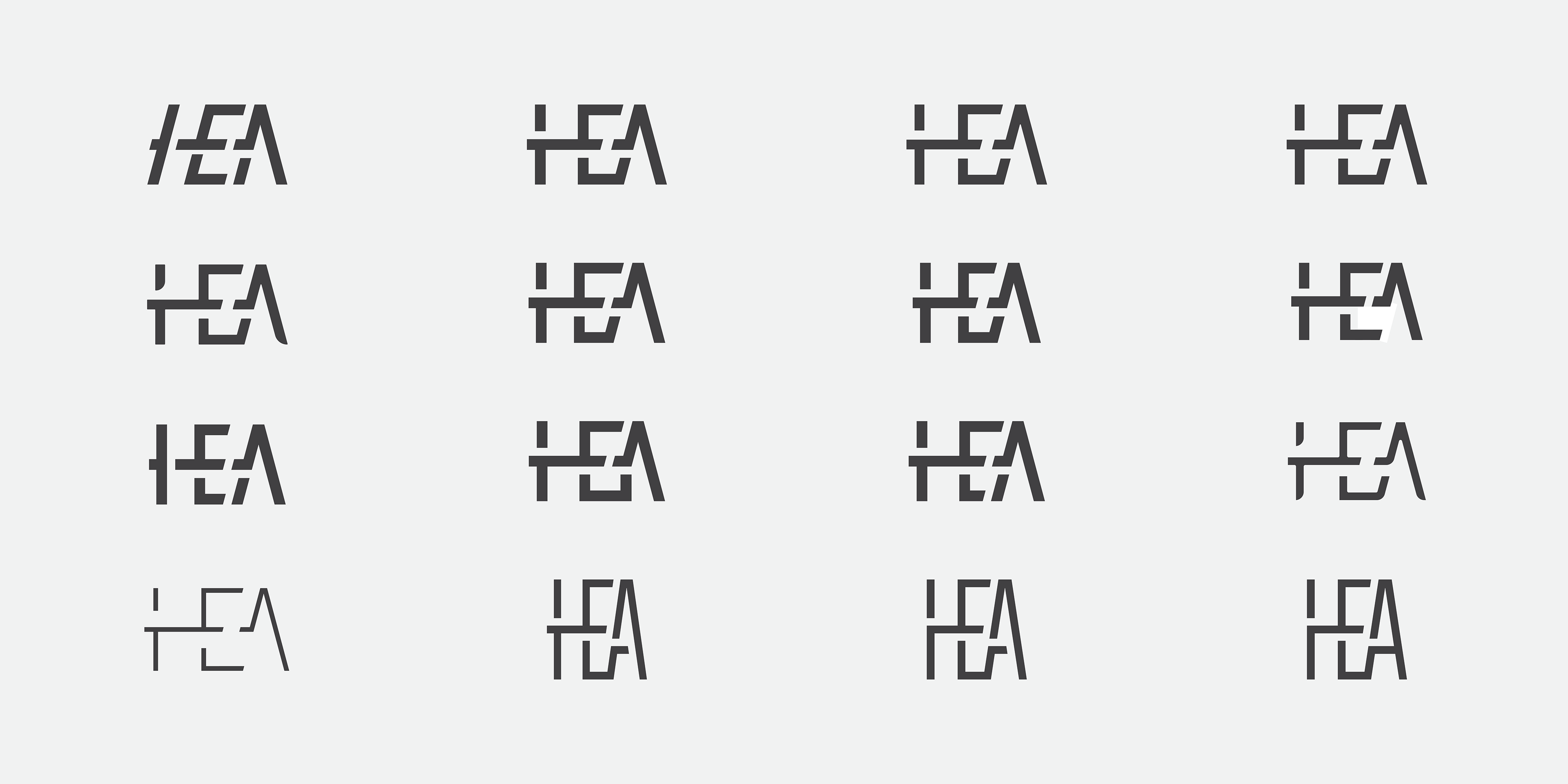
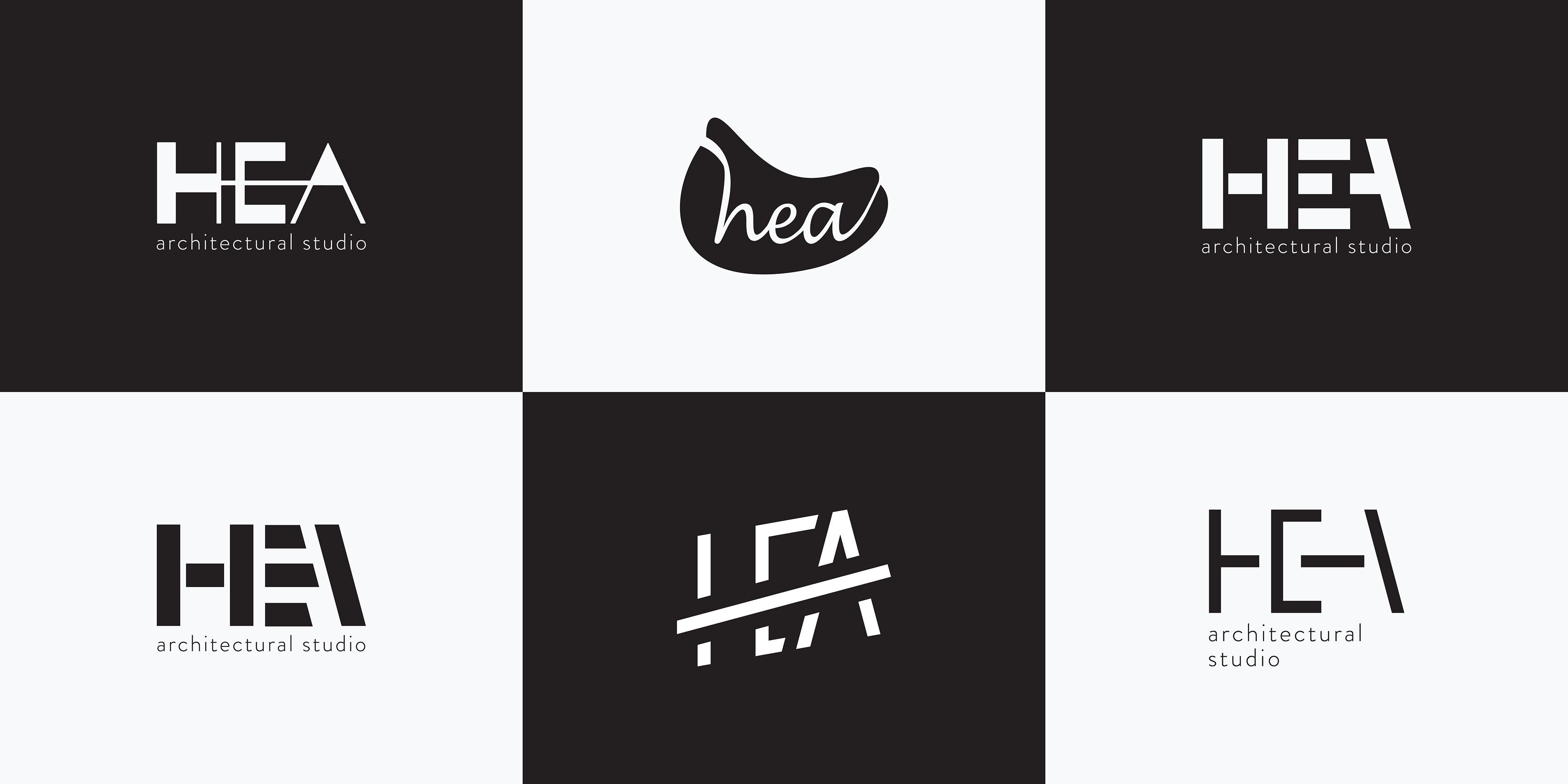
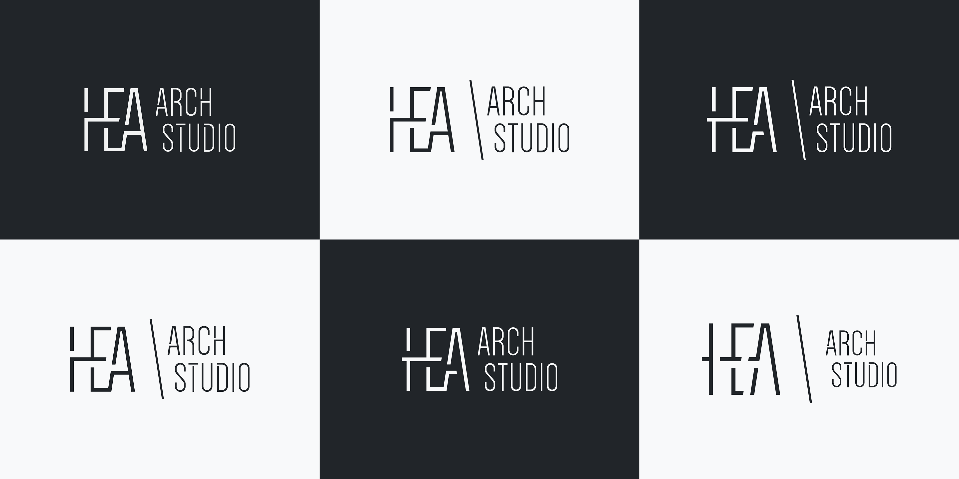
As the foundation, I sought to harmonize the letters H, E, and A - a union that emerged after extensive research and a deep dive into the industry landscape. Each iteration was a canvas of exploration; from font selection and meticulous editing to the creation of bespoke letterforms, every step was a stroke towards perfection.
To complete this visual narrative, a subtitle was introduced, giving depth and meaning to the entire composition. It wasn't merely a logo, but a harmonious fusion that conveyed unity and coherence. The interplay of logo positioning, alternates, and the sculpting of title and logo contours further refined the narrative.
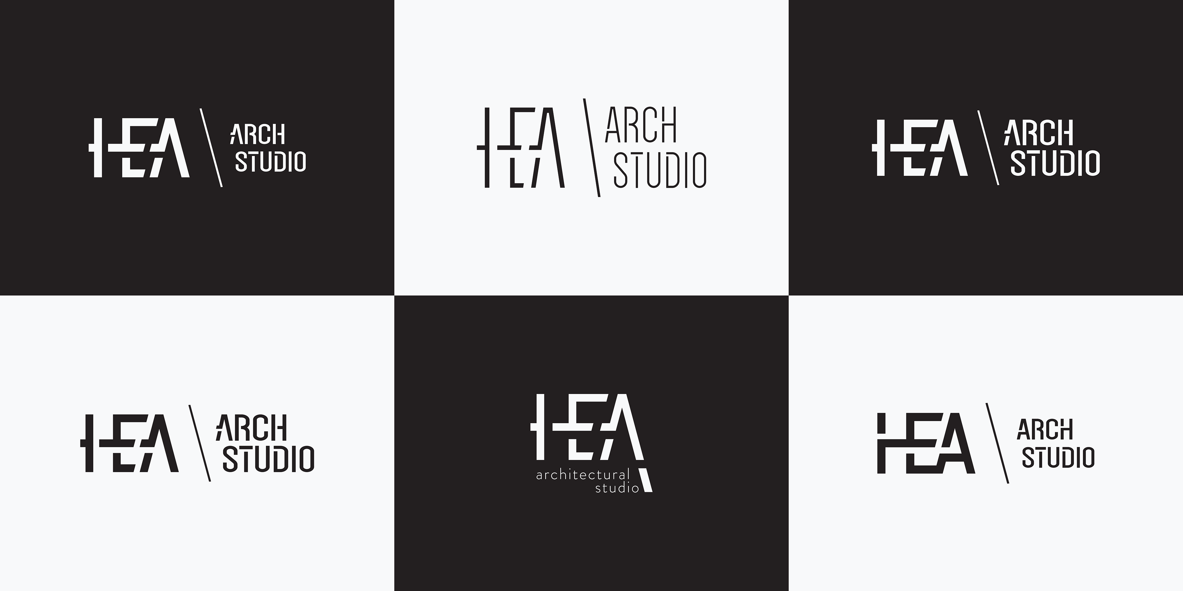
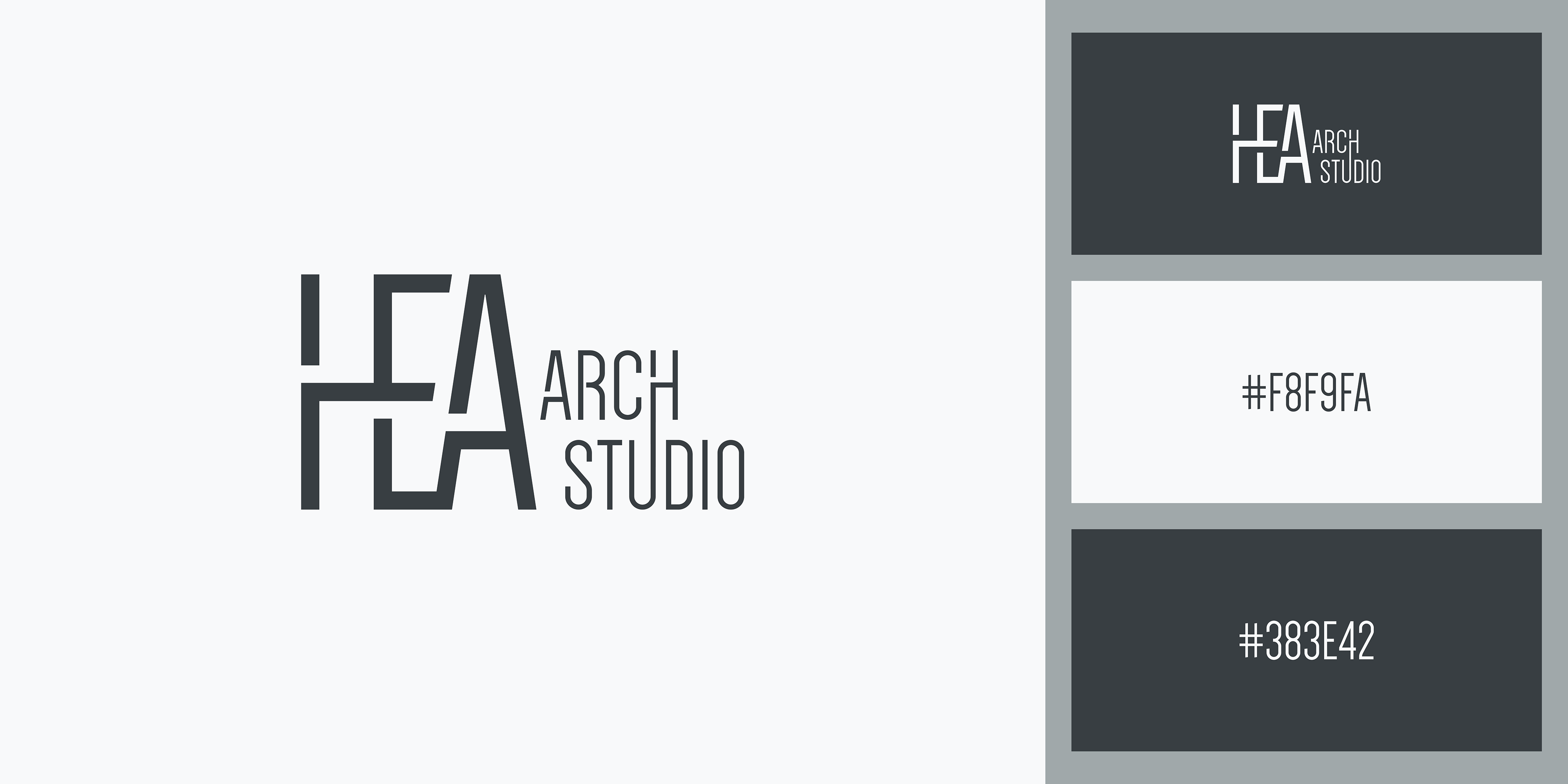
In the culmination of this creative odyssey, the final design took shape. Subtle tweaks in colour palette, positioning, and meticulous attention to the minutiae brought forth a logo that exuded finesse and sophistication.
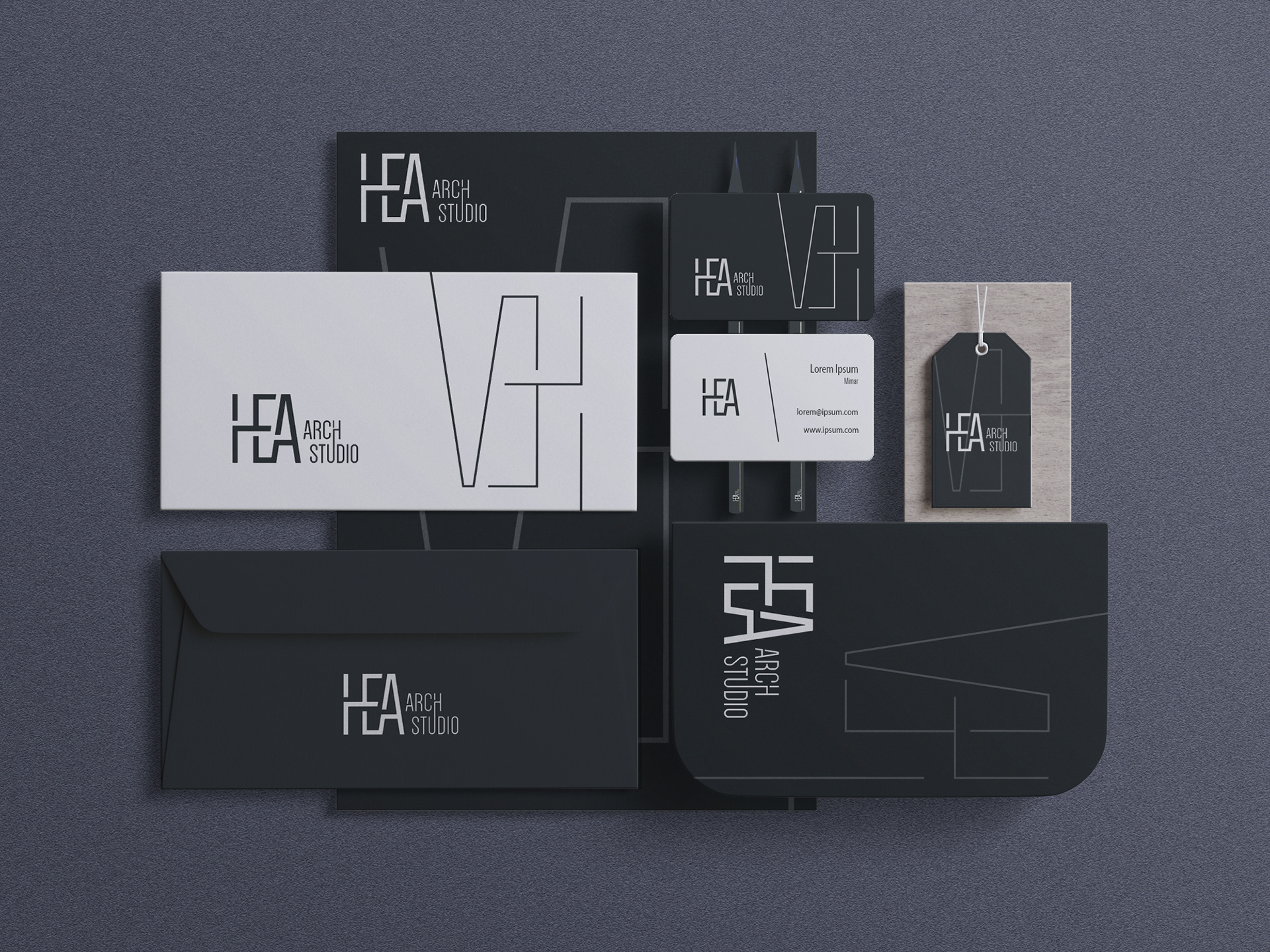
With the logo as the nucleus, I set out to fashion a brand identity that resonated with HEA Arch Studio's core essence. Trustworthiness, luxury, and a distilled minimalism became the guiding principles. E-mail signatures, A4 and A3 paper layouts, both vertical and horizontal orientations, all bore the distinctive mark of the brand. The envelope, a tangible touchpoint, carried the promise of exceptional design within its folds. The business card, an introduction in its own right, embodied the studio's commitment to excellence.
This journey was not solitary, but a collaborative dance with my client. Their insights, preferences, and aspirations were invaluable threads woven into the fabric of the final design. It was this synergy that birthed a visual identity that resonated deeply with HEA Arch Studio's ethos.

Even after the design reached its zenith, the quest for refinement persisted. Research was relentless, an unyielding pursuit to unearth potential enhancements. The design, while finalized, remained dynamic, a living entity poised for evolution. In retrospect, this venture was both a challenge and a reward. It demanded meticulous attention to detail, unfaltering dedication, and a discerning eye for aesthetics. The outcome, a testament to the collaborative spirit and the power of visual storytelling in the world of architectural design.